

People rarely abandon a donation because they suddenly stopped caring about the mission.
They abandon it because donating became work.
Imagine someone hears about your ministry, church, or nonprofit and decides to give.
Now they have to find the right donation button.
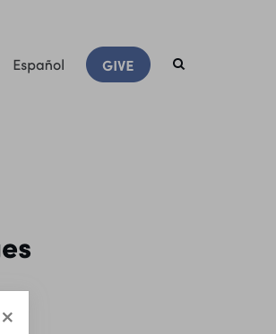
They click it — and are sent to another page. The gift is not finished. On that next page they have to find and click a second button.
Step 2. After the redirect, there is another button to click before giving can even begin.
A popup opens. They still have to choose an amount, then continue.
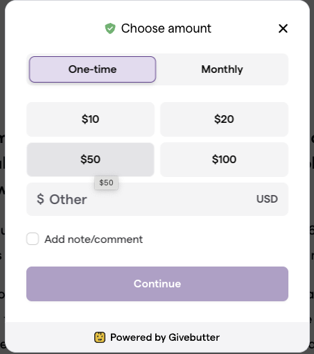
Only after that do they enter card or payment information, confirm their choices, and finally donate.
That path usually looks like this:
- find the donation button,
- click it and get redirected to another page,
- click a second button,
- wait for a popup to open,
- choose an amount,
- enter payment data,
- and only then complete the gift.
Every additional step creates another opportunity to stop.
The problem is not that people are unwilling to give.
The problem is friction.
A Better Donation Experience
Now imagine a different path.
The donor opens the site, chooses a gift — or several — on one form, and is ready to submit.
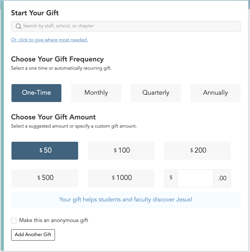
Payment information is already filled. They click Submit.
Done.
Fewer steps means less time to reconsider, less confusion, and a higher chance the gift actually happens.
That experience feels dramatically different because it asks less of someone who already made the most important decision:
“I want to support this organization.”
Your donation system should make that decision easy to complete.
The Best Donation Flow Is Usually the Simplest One
For churches and nonprofits, donation pages often grow more complicated over time.
New campaigns are added.
More fields appear.
Internal departments request additional information.
Different funds require different workflows.
Eventually, a page designed to help people give starts behaving like an administrative form.
That is when organizations should ask an important question:
Does the donor really need to do this?
Every field and every screen should have a reason to exist.
If information can be prefilled, prefill it.
If a choice can be inferred, infer it.
If a donor can use a saved payment method instead of typing a card number, give them that option.
If a question can be asked after the donation instead of before it, consider moving it.
The goal is simple:
Remove everything that stands between the donor and the completed gift.
Your Technology Should Support Generosity, Not Slow It Down
A donation page is not just another form on your website.
For many churches and nonprofits, it is one of the most important conversion points in the entire digital experience.
A slow, confusing, or overly complicated giving process can undermine the work you are already doing to bring people to your website.
A good donation flow does the opposite.
It feels natural.
It works on mobile.
It remembers returning donors where appropriate.
It supports modern payment methods.
It clearly explains what the gift supports.
And it gets out of the donor’s way.
At IT Sanctuary, we help churches and nonprofits improve donation experiences, connect giving platforms with websites and CRMs, and remove unnecessary friction from digital workflows.
Because when someone decides to support your mission, technology should help them complete that decision — not make them work for it.
How many steps does it take to donate on your website today?